⏏ Top of Page
⏏ Top of Page
Although she started producing visual art when she was 20, Tere didn't learn graphic design until late 2013, when she was building her own website. Through a combination of mentors, videos, Adobe's blog, and trial and error, she created this site, and then never stopped designing. Having now spent several years honing her skills, Tere designs clients' websites, social-media graphics, and campaign collateral. This page represents a small sample of that work.
JAWW
JAWW
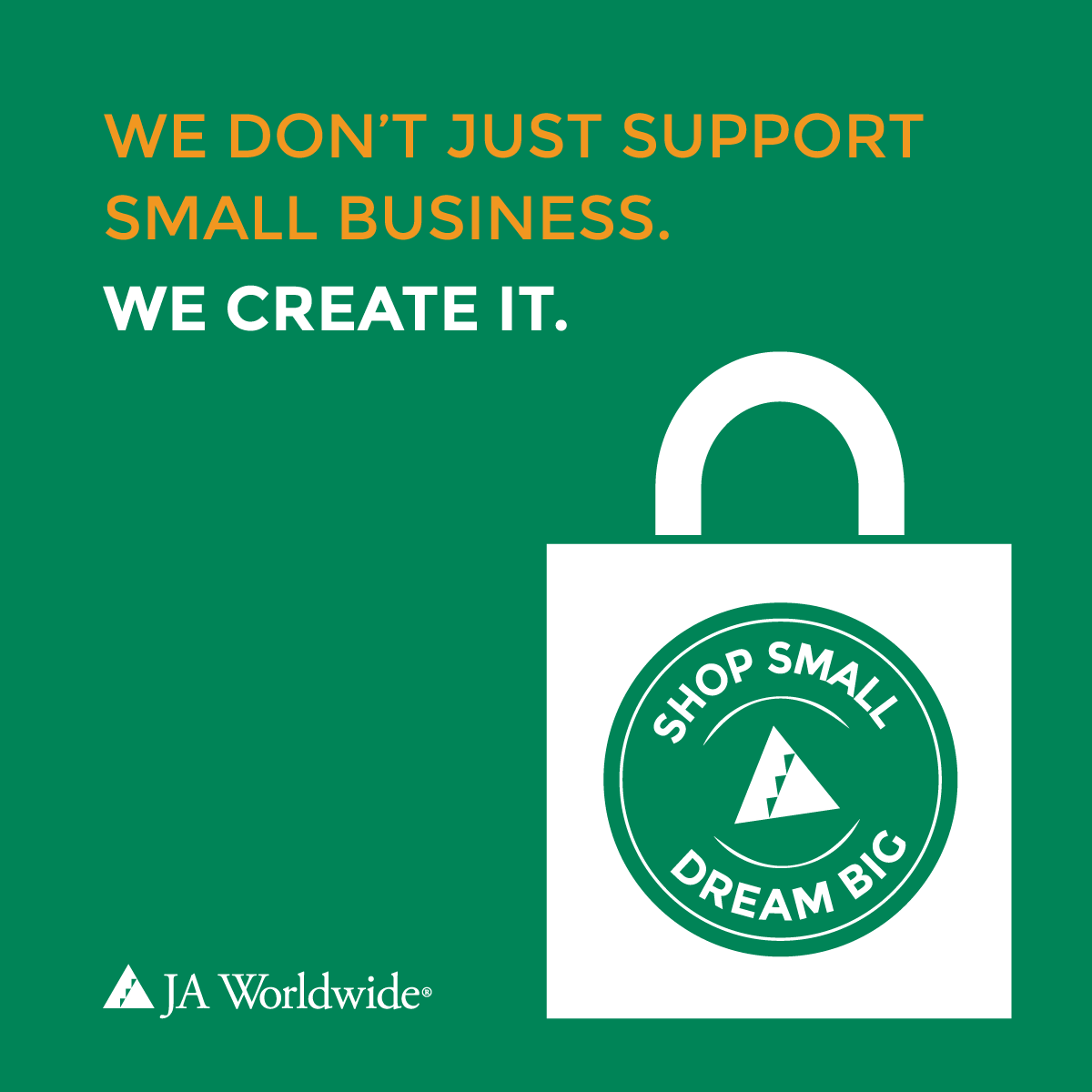
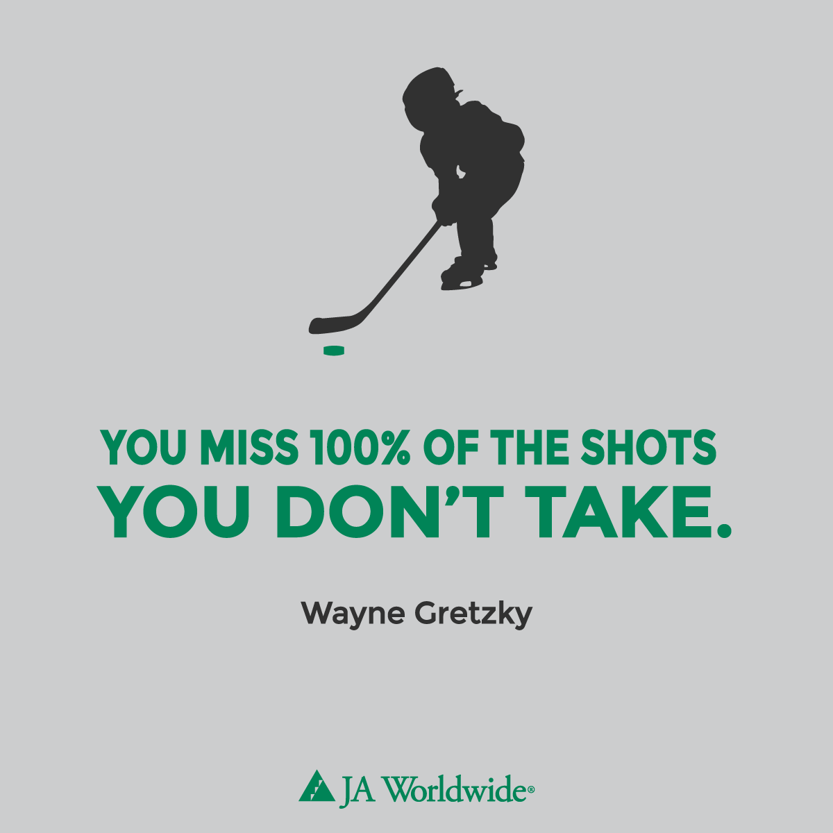
JA Worldwide
Note from Tere: JA (Junior Achievement) Worldwide is active in over 100 countries around the world and has a vibrant, full color palette that includes several shades of green and orange. We've introduced gray to the color palette as a way to offer variety to their website and social-media channels, and have greatly expanded the type/font list to add variety to social graphics, which are often inspirational quotes that are designed to fit the JA brand and mission.
I also built (that is, wireframed, designed, copywrote, and custom-coded) JA Worldwide's website and online Year in Review, which are both hosted on Squarespace. Building a website that features multiple corporate partners, six regional operating centers, and the more than 10 million students served each year was a design challenge. You'll see some of the ways we've highlighted each in the links provided. We've also recently launched a thought-leadership magazine on Medium.
UWNYC
UWNYC
United Way of New York City
Note from Tere: United Way of New York City serves 8.2 million New Yorkers through educational, health, and income-stabilizing programs and also works with the city's nonprofits to strength their boards and build capacity. With only a three-color palette (red, white, and black), two of which are strong, we worked to introduce shades of black to create more variation.
Santa Monica
Santa Monica
City of Santa Monica
Note from Tere: Santa Monica recently created a city-wide $15 minimum wage, and was looking for simple, eye-catching social-media graphics to drive city residents to the city's minimum-wage website. They wanted to ensure that at least two of the graphics could be used for paid ads on Facebook, which call for no more than 20 percent text.
AMA
AMA
American Marketing Association
Note from Tere: Some of the most rewarding work I do is pro-bono; in this case, for the American Marketing Association's Nonprofit Marketing Conference. This was quick-and-dirty work: What could be do to promote the conference in just a few hours of design time. Also see an infographic/infovideo in the next section.
Other
Other
Infographics and Infovideos
Note from Tere: Everybody loves infographics, but they sure are hard to post on social media. My advice? Post your infographic on your website, and then create an infovideo (to use on Facebook and Instagram) and/or smaller graphics that feature only one part of the infographic.
Contact
Contact
CONTACT TERE
Looking for digital graphics? Send Tere a note.


